Remember the dreaded group work while you were in school? Ugh. Me too.
But after moonlighting as a Marketing Professor, I figured out why instructors use it. Students don’t read. They skim. And they don’t even skim well. Put them in a group together and they’ll actually learn something.
As an instructor, I was learning a ton of good info, because I did all prep for the class. I read every chapter, built the PowerPoint for the lecture, I sifted through hundreds of questions for the quizzes, and I created — you guessed it, group work activities. And the number one thing I learned: People, all ages, no matter how much they’re paying in tuition — they don’t read. In fact, if you made it this far without skimming: you’re ahead of the game! If you read this and implement even one tip or trick? My friend, you’re on your way to website hall of fame.
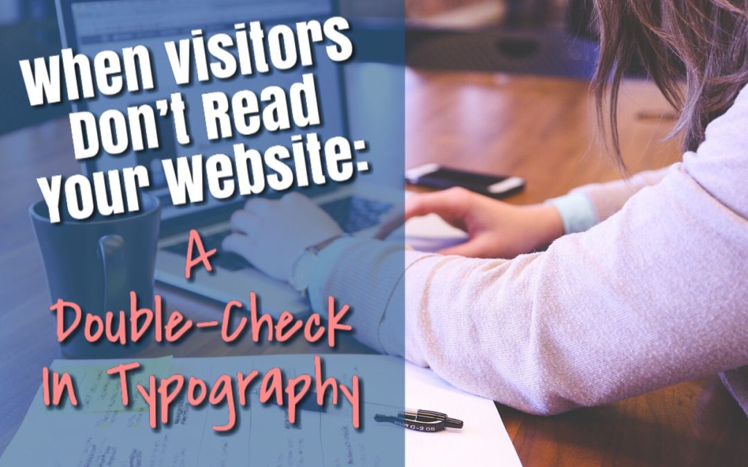
This post is a foundational double-check for your website so you can capture “skimmers” and convert them to buyers. God knows, they’re out there.
Emphasis
Giving emphasis to a word without interrupting your reader is super smart. (See what I did there?) And bold text isn’t your only option. The long standing go-to option is italics, but you can also use bold font, small caps, underline, type size, color or a different typeface/font altogether. Important that you choose one and stick with it throughout.
Bold font
Great, so you’re going to use bold font. But how often should you use it? Using it to draw attention to a specific line, price, promotion, or question, bold text is awesome. Use sparingly. When done well, your non-reading visitors will scan the page with their eyes landing on each bold sentence. Tell them your story in these bold headings and you’ll find they’ll be more likely to receive your message and take action. On the contrary, when you stuff your entire page with bold text your reader’s eye will miss important details, every time.
Poor line spacing
Building a website to be responsive on mobile devices makes this next one critical. There is a natural line space between this sentence and the one above and the one below. But it’s because I’ve typed this in the same website module. However, sometimes you need multiple modules stacked on top of each other. Like a large heading, with a subheading, and one that begins your paragraph. Ensure the line height between these items is just right. Not too scrunched. Not too far apart. You know, Goldilocks and the three bears style.
Whitespace
Similar to line spacing, your eyes require space around text, images, photographs called whitespace. Despite the name, the space or background around images doesn’t have to be white, but it does need to be empty. If you’re working with your designer and something feels too busy for you, it’s your eyes telling you: you need more white space around images or objects. Be sure to speak up.
A good designer will have a variety of options or changes for you to consider. He or she will need your feedback. After all, you’re the one who has to use the site or document as a tool in your business. If your goals depend on the success of the website (or even a billboard, postcard, flyer or PDFs) be sure to speak up. Having confidence about your site or document is a big deal.
Contrasting/complementary colors
An important element in every design is contrast. Why? It helps to organize a website and establish the hierarchy of information. Where should the reader look first? What’s more important? A website where everything is the same size, shape or exact color gets boring and fast. Using contrasting colors in a balanced way will guide your reader down the page.
What are your options?
Try contrasting with light and dark colors, or with color hue, color intensity (aka saturation), color temperature (cool, neutral and warm). Some of my favorites are complementary colors, which are colors on opposites of the color wheel, such as blue and orange or red and green. I also love when I see a dark muted grey or muted forest green with a high-intensity color of red-orange.
Text over images (for websites)
Three important items here. First, refer back to contrasting colors. Hard to read something if you can’t see it. Secondly, design your website so the text lives in a mobile-responsive module that overlays on the image. That way, if an iPad, an iPhone, and Android phone users check out your site, the image will size correctly for their device.
Finally, using a module over your text allows Google’s search engine bots to read it and help others find your site. Maybe the words are promoting a product, a sale, or simply a valuable brand description of your business. You can’t get any SEO credit if Google can’t read them. Be sure to separate the image and the text.
Wordiness
Get to the point. Don’t write your website copy (or any copy for that matter) as if its an exercise to prove you know every word you’ve ever used. It’s not. Instead, your website is an exercise to prove you know the right words to say at the right time in your buyer’s journey. Move from general to specific. I like to think of an inverted triangle or a watercolor painting. Start with large concepts, large brush strokes and then move into the finer detail. Always, always proofread aloud while asking yourself: Is that a sentence needed for my reader to take action? Needed. Not helpful. Do they need that sentence or can I cut it?
With that said. Do you have any website pet peeves? What bothers you about other people’s websites? What challenges are you trying to tackle on your own website?
Recent Comments